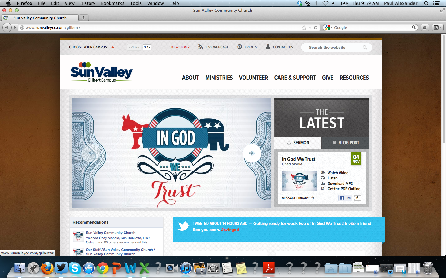
At Sun Valley we recently just completed a ground up redesign and launch of our website. Here are 5 reasons why we did, and you might want to as well:
1. Ease of Navigation
We understand that for many people our website is their first interaction with our church. So we worked hard to simplify navigation, make it easy for people to find what they are looking for, and answer questions people were asking. It meant choosing to be clear over being cute and get rid of “insider language” and simply call stuff what it is. For example you may have a “Stephen’s Ministry” at your church (great ministry BTW). But if you’re an outsider and you’re looking for care you have no idea who Stephen is and what’s so special about his ministry.
2. Going 2.0
To be honest our last website was really nothing more than an online brochure, very 1.0. With the new website we wanted to create more of a 2.0 feel with the integration of social media (Facebook and Twitter), blogs, and media that can be easily interacted with. We want to invite conversation and interaction, not just give people information. Information doesn’t change people’s lives, relationships do.
3. Re-branding
We needed to rebuild our website not just do a facelift. It was important to us that our website more closely reflect the brand and culture of our church. We intentionally worked to keep it clean, clear, and simple. We also worked to orient the website around our pathway and help people take steps in their spiritual journey.
4. Timing
This year we recently made the change from 1 campus to three campuses. We needed a website that was consistent in brand but could be unique based on the uniqueness of each campus. With the shift to multiple campuses and the re-brand that took place in the middle of it all, it was the perfect time to tackle this project. Not to mention going live now allows us to get any bugs worked out before a wave of people we anticipate seeing this Christmas.
5. Simple Updates
A practical change we made was that we had a simple content management system built that ministries could use to update the content and keep their areas of the site current. Nothing is worse than going to a website and getting old, stale, out of date information. Instead of the old system of going through one person to make all the updates (who has time for that), the new system allows for ownership, faster decision making, and current content for users to interact with.


Leave a Reply